Table of Contents
Overview
A set of styles that can be used to quickly style a React Native application. Use the Theme to style the components and accept an ITheme property to allow users to override the component theme.
The project attempts to solve the 'magic number' problem that can occur when implementing a design team styles. Most design systems have a set of re-useable styles that pervade all designs that are created. These are usually refered to by their aliases; 'normal padding', 'primary font', etc. This project attempts to re-create those aliases for React Native projects.
Using aliases prevents magic numbers such as padding: 16 and replaces them with aliases such as
padding: theme.padding.normal. When the design team needs to change the size of 'normal padding', the theme can be
updated and all references will receive the new padding size. Without using aliases, engineering will need to spend
effort figuring out where all the magic numbers are and update them.
The styling library has aliases for many common design aliases spanning animation, borders, padding, margins, fonts, colours, etc. They should be used when creating default styles for a component and also allow a overrides from a ITheme property on the component.
import { ITheme } from '@ef-carbon/react-native-style';

export interface IProps {
  theme: ITheme;
}

export default class Component extends React.PureComponent<IProps, {}> {
  render(): React.ReactElement<any> {
    const { theme } = this.props;
    const container = {
      margin: theme.spacing.normal
    };
    return (
      <View style={container}>
        <Text style={[
            theme.font.primary,
            theme.margin.large,
            theme.padding.small,
            theme.border.radius.tiny,
            theme.border.width.large,
            theme.colour.border.primary.normal,
            theme.colour.background.primary.normal
          ]}
        >Hello, world!</Text>
      </View>
    )
  }
}
The style units can also be used to build up custom base styles:
import constants from '@ef-carbon/react-native-style';
import { StyleSheet } from 'react-native';

export default const styles = StyleSheet.create({
  text: {
    color: constants.colour.red.normal,
    backgroundColour: constants.colour.red.light,
    borderColor: constants.colour.red.dark,
    borderWidth: constants.border.width.normal,
    margin: constants.spacing.large,
    padding: constants.spacing.small
  }
});
The project provides a default stock Theme that can be finely tuned using overrides:
import {
Theme,
Constants,
Font,
FontSize,
Colours
} from '@ef-carbon/react-native-style';
const fontSize = new FontSize({ base: {
200: 9,
300: 12,
400: 14,
500: 16
}});
const font = new Font({ size: fontSize });
const colours = new Colours({
grey: {
100: '#eff3f5', // theme.constants.colour.grey.lightest
200: '#dbe6ec', // theme.constants.colour.grey.lighter
300: '#99a9b3', // theme.constants.colour.grey.light
500: '#67747c', // theme.constants.colour.grey.normal
600: '#3b444f', // theme.constants.colour.grey.darkened
700: '#2c3643' // theme.constants.colour.grey.dark
},
blue: '#1c5ff5' // theme.constants.colour.blue.normal
});
const constants = new Constants({ font, colour: colours });
const theme = new Theme({
base: 'blue',
constants
});
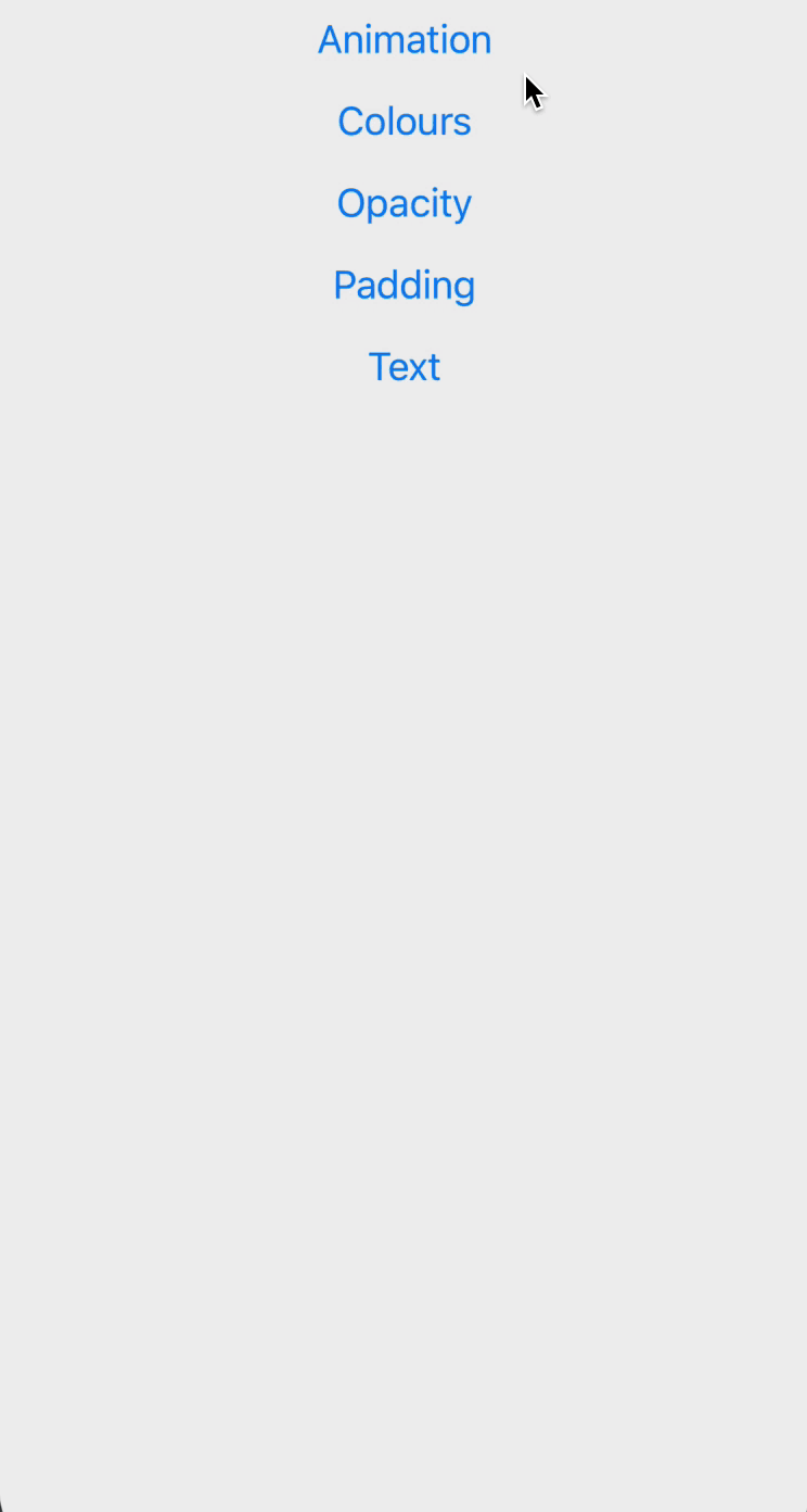
export default theme;There are a few styling classes that document which property names are available (large, small, etc):
The structure of the styling tree is documented in the various interfaces. Any IDE can auto-complete the available styles.
The styling library revolves around the concept of divisions. See the IDivisions interface for more information.
Guides
The following guides provide step-by-step instructions for utilizing the @ef-carbon/react-native-style project.
Building a Themed Component
This guide provides the steps to build out a React Native component that uses the @ef-carbon/react-native-style
aliases to their fullest. At the end of the guide we will have a React Native component that has default styling
derived from the style constants but also can accept a ITheme property that can theme the component.
Create the Component Boilerplate
It is good practice to group a component under a folder so that all related files are adjacent. It allows the static styles to be moved into their own module. Create the following folder structure:
ThemedComponentstyles.tsindex.tsComponent.tsx
Static Styles
Add the following to the styles.ts to provide the boilerplate static styles:
import { StyleSheet } from 'react-native';

export default StyleSheet.create({
  container: {},
  text: {},
});
We will add to the static styles later
Component
The following is the recommended boilerplate for a TypeScript React Native component:
import * as React from 'react';
import { StyleProp, Text, View, ViewStyle } from 'react-native';

import styles from './styles';

/**
 * The properties for the `ThemedComponent`
 */
export interface IProps {
  /**
   * Allows the user to provide outside styles to the be applied to the component
   */
  style?: StyleProp<ViewStyle>;
}

/**
 * The state for the `ThemedComponent`. This can often be emitted as not all components have state but is provided here
 * for completeness
 */
export interface IState {}

/**
 * Unless there is a need, it is always best to extend the `PureComponent` to avoid the ability to implement
 * `shouldComponentUpdate` which only allows updates when the props or state changes.
 */
class ThemedComponent extends React.PureComponent<IProps, IState> {
  /**
   * Performs the rendering of our component
   */
  render(): React.ReactNode {
    // Unpack the users style
    const { style: propStyle } = this.props;

    // Our base styles
    const baseStyle = styles.container

    // Combine the styles with the correct precedence order (we want user styles to override default styles)
    const style = [ baseStyle, propStyle ];

    return (
      <View style={style}>
        <Text style={styles.text}>Hello, world!</Text>
      </View>;
    );
  }
}

/**
 * Any static methods or properties that are available on the component
 */
export interface IStatic extends React.ComponentClass<IProps> { }

/**
 * Check that our themed component has the correct static properties and methods on it. Also checks the default React
 * static properties have been implemented correctly (if we add them in the future)
 */
const component: IStatic = ThemedComponent;

/**
 * Export the constructable component type
 */
export { component as Component };

/**
 * Export the component as the default export
 */
export default ThemedComponent;
Index
Finally we need to make sure our component gets exported from the folder. Add the following to index.ts:
import Component from '@lib/Component';
export * from '@lib/Component';
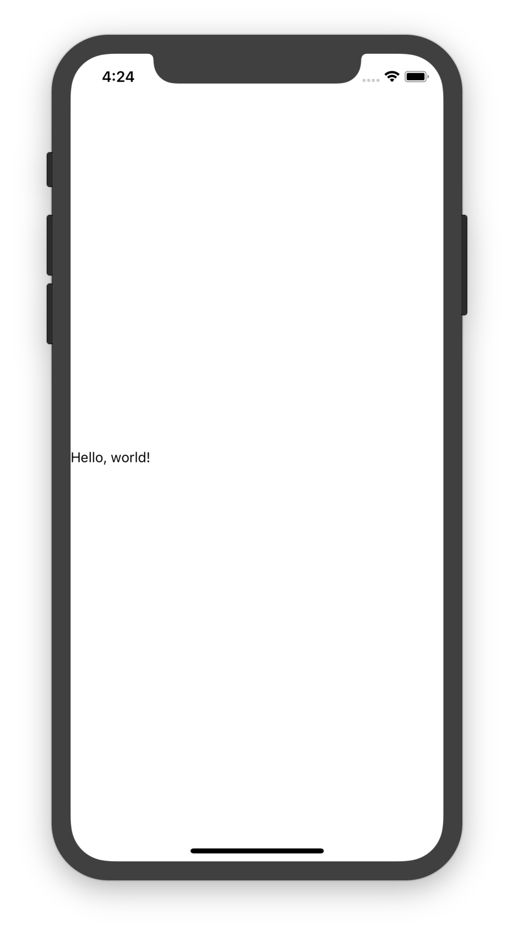
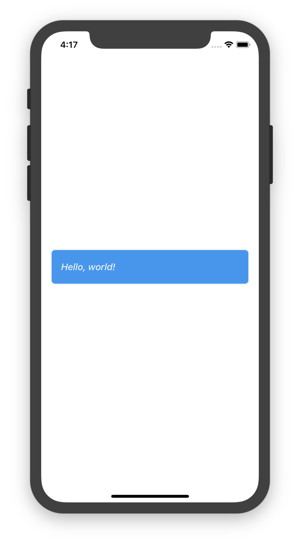
export default Component;Screenshot
Once the above boilerplate is in place, we should have the following component:
Use the Styling Constants
We would like to give the component a default style. We can use the exported constants to provide sane looking defaults.
We will update the styles.ts static styles.
import { StyleSheet } from 'react-native';

import { border, colour, margin, padding } from '@ef-carbon/react-native-style';

export default StyleSheet.create({
  container: {
    // Use the spacing mixins (could also do this with `margin: spacing.normal`)
    ...margin.normal,
    ...padding.normal,

    // Use the default border aliases
    borderRadius: border.radius.normal,
    borderWidth: border.width.normal,

    // Add some grey
    borderColor: colour.grey.darker,
    backgroundColor: colour.grey.lightest,
  },
  text: {
    // Use a default colour
    color: colour.grey.darker,
  },
});
Add the theme Property
We would now like to allow users of the component to provide a theme to the component. We can pick out certain values
to allow the component to be themed. First we must add the theme property to the Component.tsx:
import { ITheme } from '@ef-carbon/react-native-style';

export interface IProps {
  /**
   * The theme for the component
   */
  theme?: ITheme;
}
We can then pick out values from the theme to style the component:
class ThemedComponent extends React.PureComponent<IProps, IState> {
  render(): React.ReactNode {
    const { style: propStyle, theme } = this.props;
    const baseStyle = styles.container

    // Pick out relevant aliases for our component
    const themeStyle = !theme ? undefined : {
      // Override the default styles with the theme
      ...theme.margin.normal,
      ...theme.padding.normal,
      ...theme.border.radius.normal,
      ...theme.border.width.normal,

      // Use the colour aliases
      ...theme.colour.border.primary.normal,
      ...theme.colour.background.primary.normal,
    }

    // Add the theme to the style. Make sure to allow the property to override the theme styles
    const style = [ baseStyle, themeStyle, propStyle ];

    return (
      <View style={style}>
        <Text style={styles.text}>Hello, world!</Text>
      </View>;
    );
  }
}
We can also use the theme for the text:
class ThemedComponent extends React.PureComponent<IProps, IState> {
render(): React.ReactNode {
const style = [ styles.text, !theme ? undefined : theme.font.primary ];
return (
<View style={style}>
<Text style={textStyle}>Hello, world!</Text>
</View>;
);
}
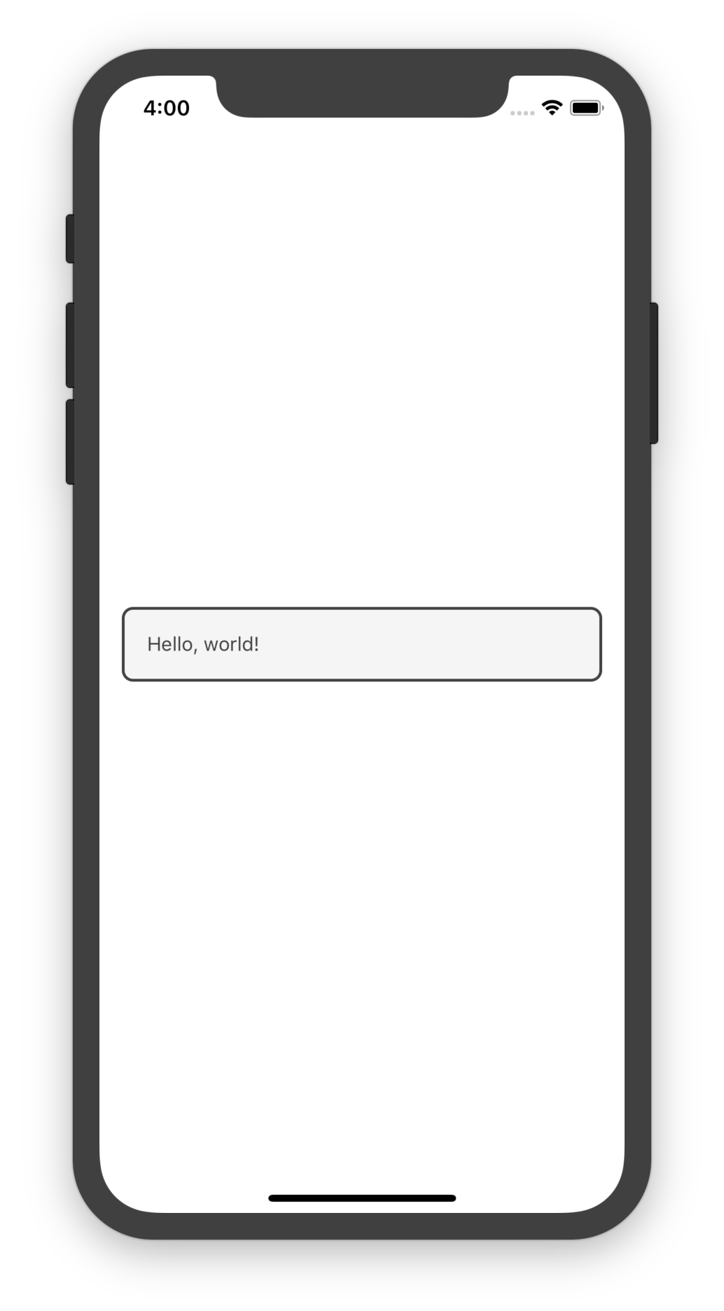
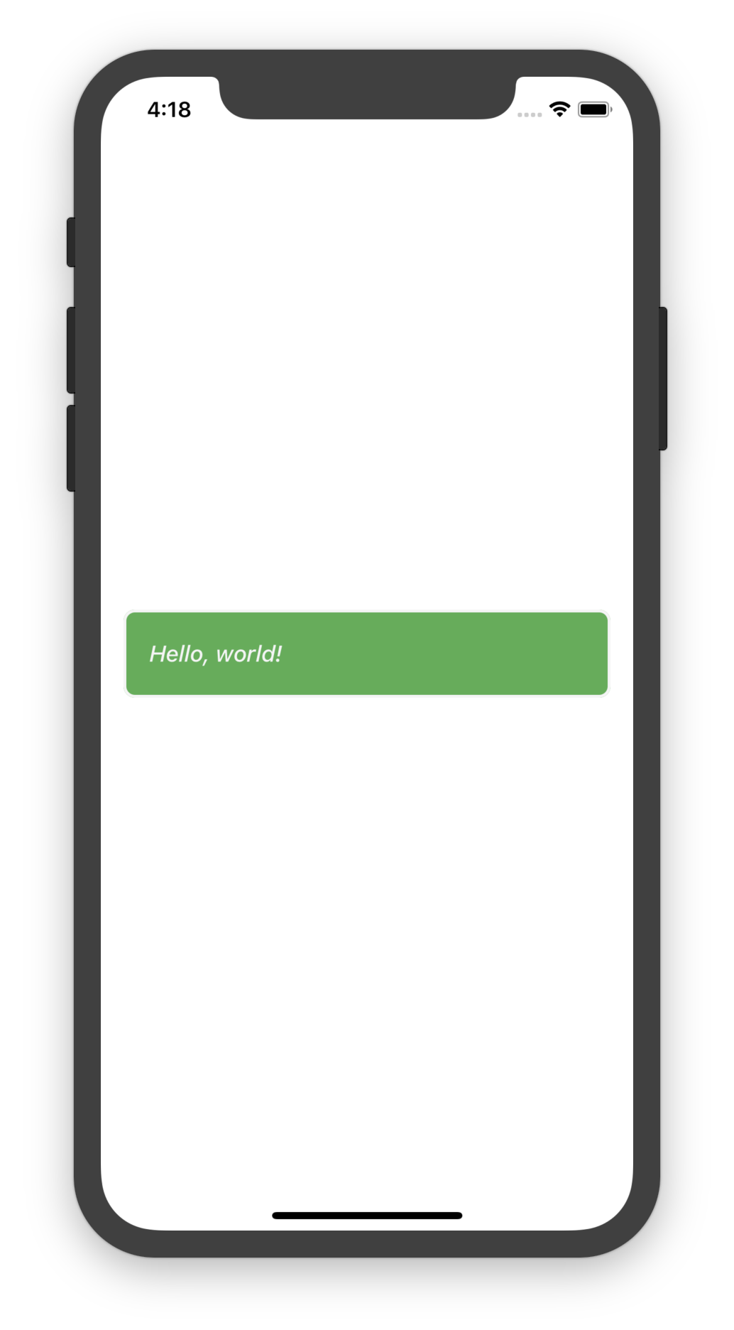
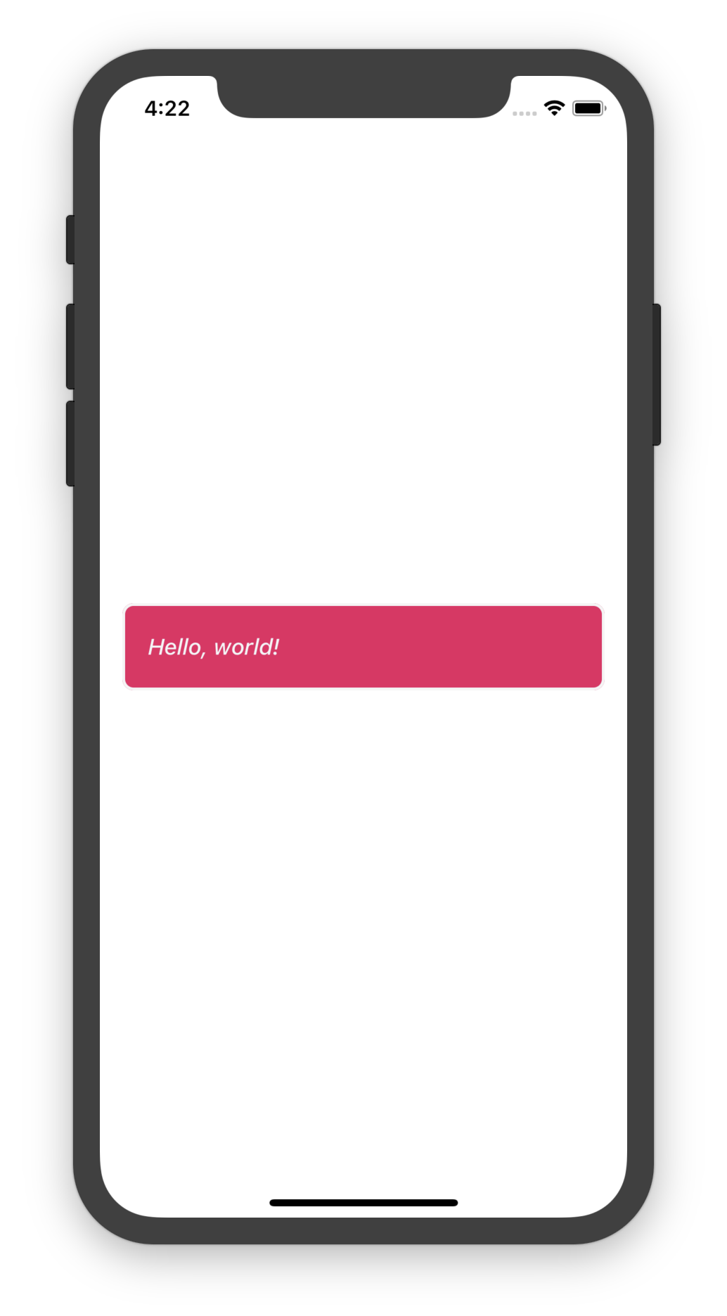
}The component is now theme-able! A user can supply a theme to the component like so:
import { Theme } from '@ef-carbon/react-native-style';

const theme = new Theme({ base: 'blue' });

function render(): React.ReactNode {
  return <ThemedComponent theme={theme} />;
}
This will result in the following render:
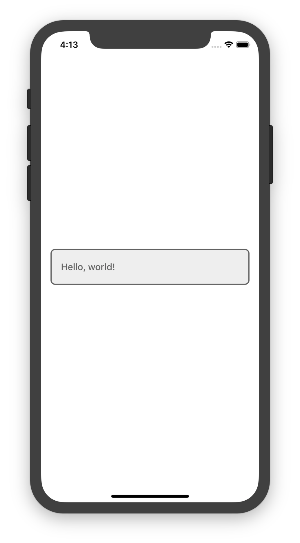
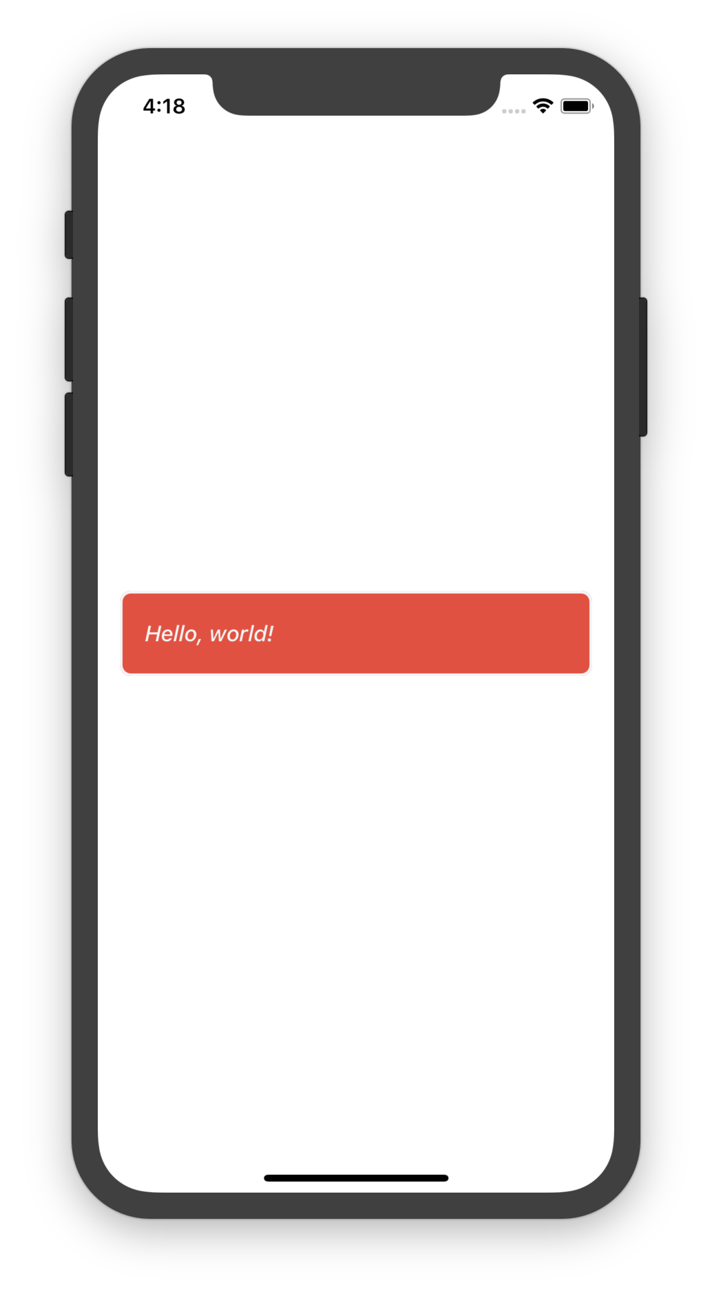
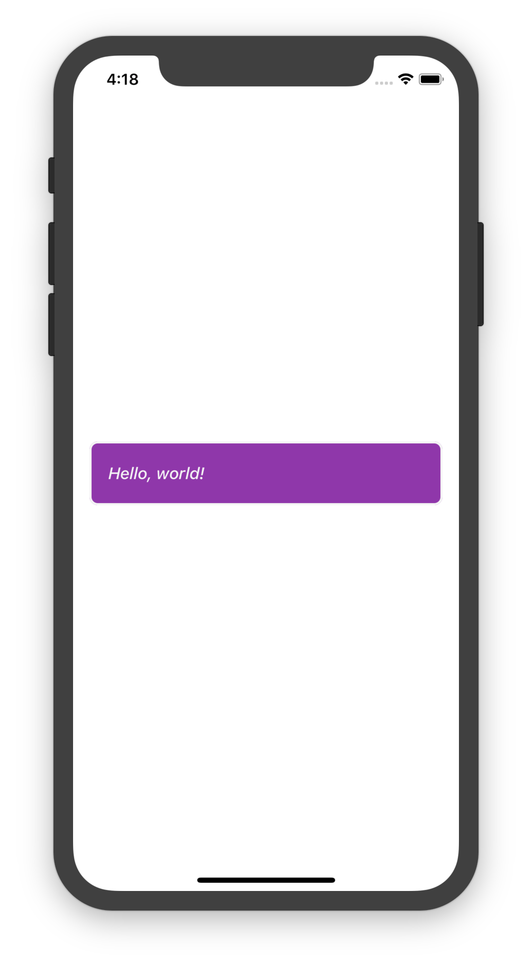
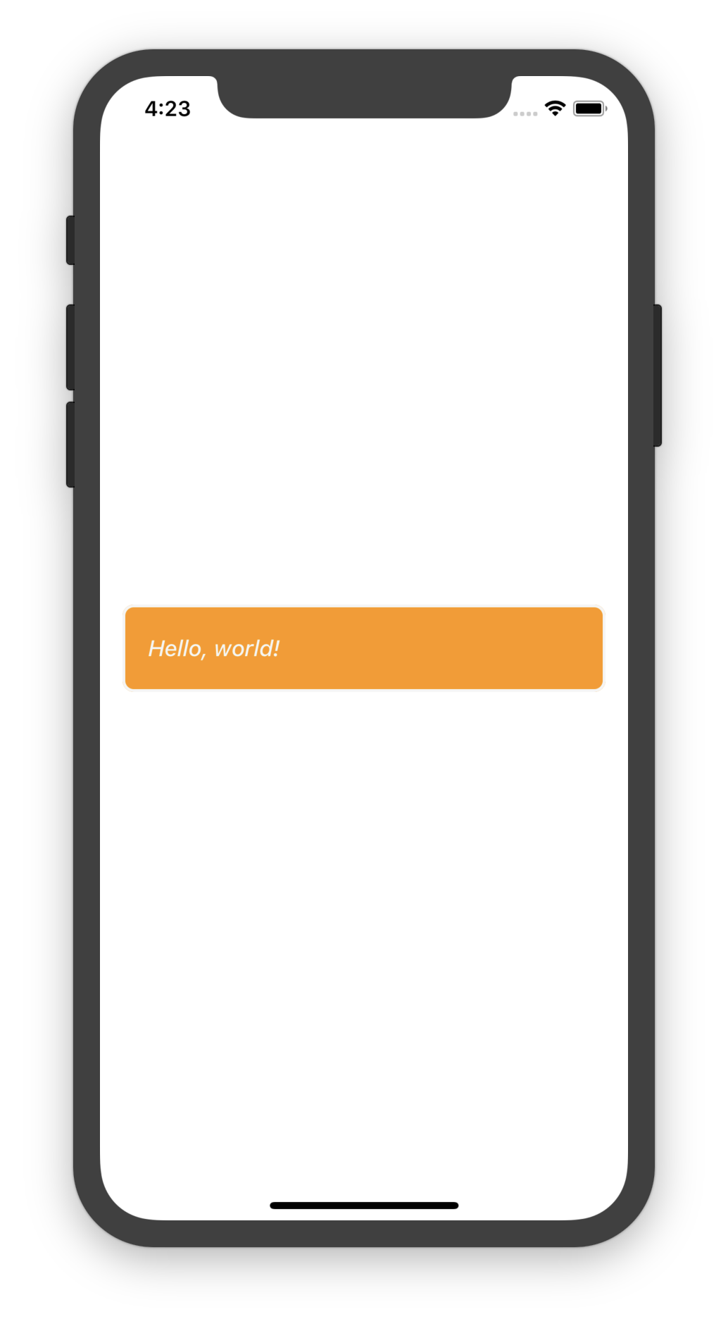
Using Other Aliases
The above render is pretty boring. We can use the accent alias, which provides an accented component which should
stand out.
class ThemedComponent extends React.PureComponent<IProps, IState> {
  render(): React.ReactNode {
    const themeStyle = !theme ? undefined : {
      // Use the `accent` colour aliases
      ...theme.colour.border.accent.normal,
      ...theme.colour.background.accent.normal,
    }

      // Use the `accent` font alias
    const textStyle = [ styles.text, !theme ? undefined : theme.font.accent ];
  }
}
The accent defaults to the base theme colour, so by just changing the base the component natually updates to the
correct colour:
Which Aliases to Use
The styling framework bridges the gap between design and engineering but there needs to be synergy between the two teams. The meaning of the aliases is important because they convey to design what they are used for. Modifying the styling of the aliases is only useful if the engineering team uses the aliases in a meaningful way.
There are two big buckets of aliases:
- Constants
- Mixins
The meaning can be negotiated between both teams but what follows are some suggestions on how to use the aliases.
Constants
The Constants are just that, constant. These are primitive values and can be used to set up static styles or animations. The constants contain the full colour swatch that is used to create the theme mixins. They specify the range of font sizes, letter spacing and line height, to name a few more.
The constants live on the theme under the constants property. If a component must have a green background colour,
then it makes sense to use the green from the colour swatch:
const style: ViewStyle = {
  backgroundColor: theme.constants.colour.green.normal  // or 'lighter', etc
}
The design team can then modify the constants to determine what a normal green is. Adding this to the code allows the design team the hook to modify that colour without changing the components code; it's not baked in with a magic number. See the available colour swatch aliases at IColours
Another example when to use a constant is when performing animations. The constants have timing and easing aliases that can be used:
Animated.timing(value, {
  toValue: 100,
  duration: theme.constants.animation.timing.normal,  // or, 'faster', etc
  easing: theme.constants.animation.easing.normal,    // or, 'easeInOutSine', etc
})
The design team can select a duration and easing function and pass that over to the engineering department. Once the engineering department has used the correct aliases the design team can tweak the duration and easing without having to change the component code. See the available aliases under the IAnimation class.
Mixins
Mixins provide pre-canned styling that can be applied to components. The most prominent of these are the theme font aliases under IThemeFont. These aliases are to be used when design meaning of some text is needed; is it a title? sub-title? code? a quote? This is when to use the font aliases:
<Text style={theme.font.title}>Greeting</Text>
<Text style={theme.font.subTitle}>What the user would like to say</Text>
<Text style={theme.font.primary}>Hey, there!</Text>
If we want a view to have the application accent colour then we can style it using the accent alias:
const style: ViewStyle = {
  ...theme.colour.background.accent.normal  // or 'lighter', etc
}
This will have the colour that was specified as the base of the Theme. If the base was set to green it
would render exactly the same as theme.constants.colour.green.normal. However, we want the view to update when the
design team (or application user, if allowed) changes the base colour of the application.
Once the aliases are used in the correct places the design team can tweak the styling of the aliases to pervasively change all of the text that uses those aliases.
The theme also contains style mixins for some of the constants. These are shortcuts that save time when writing code. The following components will be styled the same.
<View style={{ padding: theme.constants.padding.normal, margin: theme.constants.margin.normal }} />
<View style={[theme.padding.normal, theme.margin.normal]} />
<View style={{...theme.padding.normal,...theme.margin.normal}} />
The style mixins can be found on the ITheme interface for use.
Overriding the Theme
The Theme class provides a default set of aliases that themed components can pull from. It is a nested tree of style classes that pull data from the constants. The theme exposes style mixins rather than the primitive values that the constants provide.
Overriding the Constants
The constants are what the theme uses by default to determine the values for the style mixins. The Constants class can be used to customise the constants. It is, similar to the Theme, a nested tree of constants classes.
import {
  Theme,
  Constants,
  Font,
  FontSize,
  Colours,
} from '@ef-carbon/react-native-style';

// Customise the divisions used for the font size
const fontSize = new FontSize({ base: {
  200: 9,   // smallest
  300: 12,  // smaller
  400: 14,  // small
  500: 16   // normal
}});

// Package up the font size into the font constants. The rest of the font constants will use their default values
const font = new Font({ size: fontSize });

// Override some of the colours used to determine the theme mixins
const colours = new Colours({
  // Specify the specific shades of grey
  grey: {
    100: '#eff3f5',  // theme.constants.colour.grey.lightest
    200: '#dbe6ec',  // theme.constants.colour.grey.lighter
    300: '#99a9b3',  // theme.constants.colour.grey.light
    500: '#67747c',  // theme.constants.colour.grey.normal
    600: '#3b444f',  // theme.constants.colour.grey.darkened
    700: '#2c3643'   // theme.constants.colour.grey.dark
  },
  // Provide a starting value for the central blue value.
  // The rest of the shades will be automatically calculated
  // by adjusting the lightness of the colour
  blue: '#1c5ff5'  // theme.constants.colour.blue.normal
});

// Package up the colours and font constants
const constants = new Constants({ font, colour: colours });

// Use the constants in the theme that will
// be used for the style mixins
const theme = new Theme({
  base: 'blue',
  constants
});
There are various of constants that can be customised, see the Constants class for more information about overriding the values.
Overriding the Mixins
The nested theme classes use the Constants to pull data in a set of mixins that can be used to easily style components. The Theme class can have the nested classes overloaded to customise how the theme creates the mixins.
import {
  Theme,
  ThemeFont,
  ThemeColour,
  ThemeFont,
} from '@ef-carbon/react-native-style';

// Build up the default constants
const constants = new Constants();

// We need the theme colours aliases
const colours = new ThemeColour({ base: 'orange', constants });

// Customised the font shades
const font = new ThemeFont({
  colours: colours.font,
  subSection: {
    shade: 'light',  // Override the shade of the subsection
  }
});

// Create the theme with the new overrides
const theme = new Theme({
  base: 'orange',
  constants,
  font,
});